Design Elements · Imagery
Imagery
Our pictures are about people doing real work — and the technology is the context they work in, never the hero of the shot. Natural light, real color, a believable moment. This page shows what to shoot, how a photo is framed, how it carries a headline, and the tired IT-stock clichés we refuse — including a few sitting in our own library right now.
The standard
A person you could actually meet.
Our best image is one of our own people, on site — named, lit naturally, comfortable in the room. The server aisle is just the background; she is the subject. That's the whole rule in one frame: the human leads, the technology supports.


The principle
Three tests. A photo earns its place only if it passes all three — if you're reaching for an image and it fails one, keep looking.
People over hardware
There's a person in the frame, and they're the subject. Screens, racks, and devices are the setting — never the point. No faceless close-ups of cables, chips, or glowing UI.
Real light, real color
Natural, warm light. Skin and fabric keep their real tone. The brand's cool cast is added later, as a wash — it's never baked into the photo as a blue "tech" filter.
Specific over generic
A clinician reading a chart on a tablet beats "a doctor." A surveyor with a laptop on a job site beats "construction." The more specific the moment, the less it looks like stock.
What we shoot
The subjects that carry the brand: the relationship (us and the client), the work (real tasks, real tools), and the people (ours and theirs). The frames below are stock placeholders standing in for the real thing — drop your own production photos onto any tile to make a shot truly ours. Grouped by treatment, not just subject.
True to life
Clean, full-color, high-contrast frames — used as shot, sitting inside layouts, cards, and content tiles. No darkening, no headline going over them.
Our people, on the job · hero underlays
People-in-action frames with one side intentionally darkened — the quiet zone a headline and the navy wash sit over. These are the underlays that feed the full-bleed hero treatment below.
Two ways to place a photo
Same photography, two sanctioned treatments. Pick by where it lives: framed for a photo sitting inside a layout, full-bleed wash for a hero that carries a headline. The wash recipe itself lives on the Gradients page — this is only when to reach for which.

Framed — in-content
Photo keeps its real color, 20px rounded corners, lifted on an even light-blue glow (no offset, no gray drop-shadow), with the teal mark breaking out of the top-right. For cards, feature blocks, anything sitting inside the page.
.ps-frame
Financial Services
Full-bleed wash — hero
Photo is gently cooled, then one brand wash carries the navy text-scrim and the teal glow so white type stays legible. The headline always uses one gradient line. For page heroes and dark CTA bands.
--wash-navy-diagonalColor & grading
The most-missed rule: we don't drain the color out of a photo. Each image is only lightly settled — saturate(.72) brightness(.95) contrast(1.06) — so skin, fabric, and warm light survive. The cool, on-brand feel comes from the wash laid on top, not from desaturating the photograph. A full duotone is an occasional accent for a single dark band — never the default, and never on a hero with faces.
Crop & safe area
A hero photo is shot — or cropped — to leave a quiet zone for the headline, opposite the subject. Keep the face out of the text column; let the navy scrim do the legibility work. Below: the subject sits right, the headline lives in the dashed safe area on the left.

Managed IT Services
get freedom to focus.
What to avoid
The stereotypical "IT stock" tropes signal exactly the vendor we are not. They're generic, interchangeable, and faceless. These four are real files in our own library — recoloring won't save them, they need to be retired and reshot to the rule above.
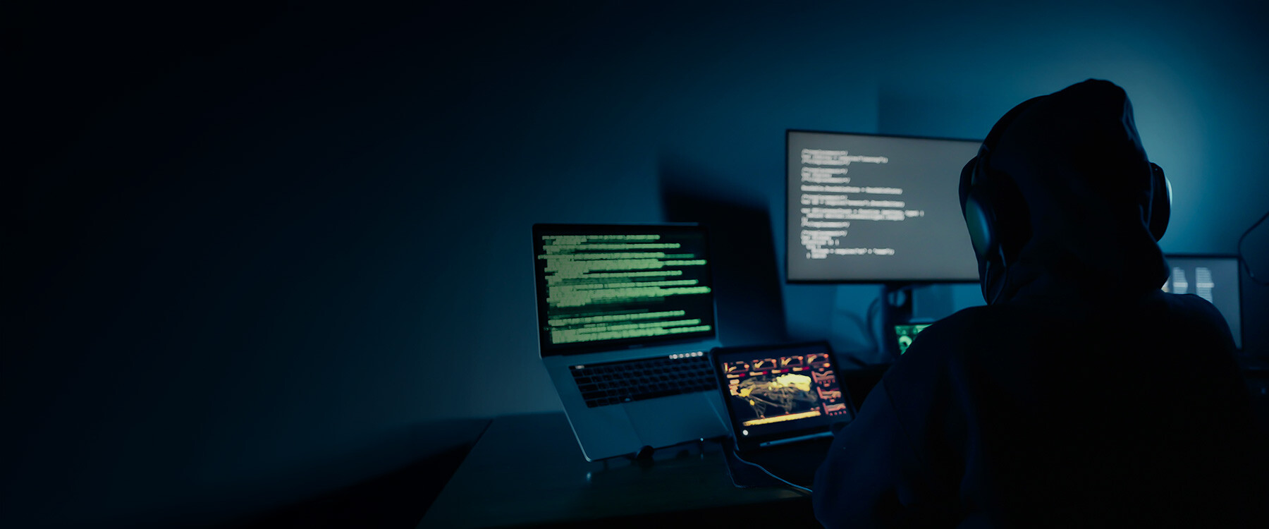
The hooded hacker
Anonymous figure, face hidden, in a dark room of green-on-black code. It sells fear, not partnership — and we can't even tell who it is. The opposite of "a person you could meet."

The binary "data" wall
Glowing 1s and 0s receding into the dark. There's no person, no work, no meaning — pure abstract tech wallpaper. Fails the first principle outright.

Holographic code overlay
A real person, buried under floating cyan code and glowing UI rings. The composited "HUD" is the giveaway of generic tech stock. Lose the overlay and the same shot would pass.

Faceless hands on hardware
A disembodied hand and a laptop against a wall of mining rigs and red fans. No face, no relationship — the gear is the subject, and the off-brand red doesn't help.
And the rest of the catalog — reject on sight
A neon lock or shield floating over a circuit board. Security as a clip-art icon, not a service.
A hand pressing a glowing UI element in mid-air. Nobody works like this.
An Earth wrapped in glowing network lines. Means nothing, says everything-generic.
Two cropped arms shaking hands over a desk. A cliché for "trust" that builds none.
A staged agent in a headset grinning at nothing. Reads as a call-center, not a partner.
Glossy rendered robots, brains, or "AI" abstractions. Not photography, not us.
At a glance
Do
- Put a person in the frame and make them the subject.
- Shoot in natural, warm light; keep real color.
- Be specific — a real task, a real place, a real tool.
- Leave a quiet zone opposite the subject for the headline.
- Add the brand feel with a wash on top, not a filter underneath.
Don't
- Make hardware or UI the hero — no faceless gear shots.
- Composite holographic code, HUDs, or glowing icons on top.
- Use hooded hackers, padlocks, globes, or handshakes.
- Bake a cold blue "tech" grade into the photo.
- Bury a face under text or scrim in the safe area.